How I’m trying to stop being the design police
Our DESIGN.md was a rulebook. Agents ignored it or worked around it. Here’s how we split design knowledge so each rule lives in one place.
 Kathryn Gallagher · 7 min read
On this page
“USE THE DESIGN SYSTEM.”
That’s what Blake, my co-founder and CEO, types to Claude, usually in all caps, usually after the second try.
A few months ago, Blake shipped a PR that looked great. Real components, on brand, done. Then I opened it up and found it had added a couple of new versions of a UI component we’d already built, the one that shows a project or a pull request in a list. That made six across the app. Six. For the same thing.
It wasn’t Blake’s fault. He doesn’t know what all our components are, and he shouldn’t have to. He did what any of us would do: he told the agent to use the design system. The agent agreed, and then decided it needed to build something new anyway.
That PR is when I realized I’d been solving the wrong problem.
It looks right. It isn’t built right.
Before any of this, I assumed the coding agent would tidy up as it went. I thought it knew our UI system and how to use it, because it works from the codebase. So when we built a new feature from rough, close-enough-to-brand UI, I figured it would swap out the hand-drawn bits for our actual components and tokens.
It invented new colors instead. We now have two of them, Cloud and Lime, scattered through our app with no clear purpose, and I get to untangle that later.
I’d never called UI “hand-drawn” before I started reviewing builds from coding agents. Now it comes up in almost every review. It’s UI the agent drew from scratch that looks like one of our components but isn’t one. It looks fine at a glance, but it breaks the moment something changes, like switching to dark mode.
That’s the pattern I keep running into. Agents are great at making something look like it was built correctly. The gaps show up later, as duplicated code, slightly different behavior, inconsistencies, and bugs. For us, that’s meant six versions of the same list row, two colors nobody chose, and a button that does the same job but lives in a different place depending on the screen, among others.
It’s not just us. CodeRabbit found, in a sample of 470 open-source pull requests, that AI-assisted ones carry about 1.7 times as many issues, including nearly twice as many naming inconsistencies.
So I did what everyone online says to do. I wrote a DESIGN.md, a file in our codebase that tells coding agents how our product should look and feel. Principles, when to use what, content and voice guidelines, anti-patterns, the works. Every time we made a new design decision, I pushed an update to it. I thought my design debt backlog would start shrinking.
Blake’s PR was proof it hadn’t. The backlog grew instead, and cleaning up what we’d already shipped took:
- 13 projects and about 30 PRs in two months
- Five screens, each drawing its own version of the same row
- Three different screen-reader labels for the same status dot
And if you read my last post, you know I don’t have time to be the design police or the clean up crew. But I still need a consistent app, fewer UI bugs popping up, and a clean set of components we can actually iterate on and improve.
The DESIGN.md skeptics have a point. Our first version was a rulebook, and a long one: over 10,000 words. It restated rules our CSS and components already enforced, wrapped them in essays about why, then listed many of them a second time as anti-patterns.
Agents read all of it on every task, and research on instruction-following shows the more rules you stack up, the more get dropped. In one benchmark, even the best models followed only about 68% of 500 instructions, and favored the ones that came first. Atlassian tested this too: on a simple login-screen task, DESIGN.md alone used about 92% more tokens than their design-system server, and agents were more likely to rebuild components instead of importing them.
To an agent, rules written in prose are more like suggestions.
Tell it once
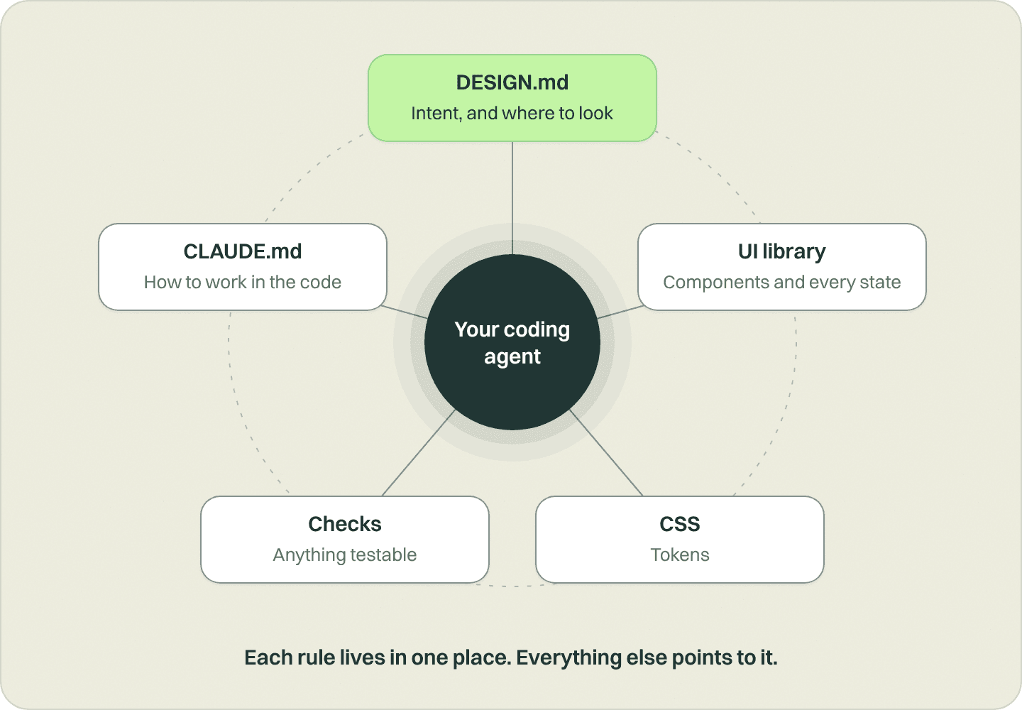
The wrong problem was writing better rules. The right one was where each rule lives. One thing we’ve learned about agent instructions, across our whole codebase, not just design: tell it once. When the same rule lives in two places, the copies drift, the agent pays to read both, and eventually it has to pick which one to believe.
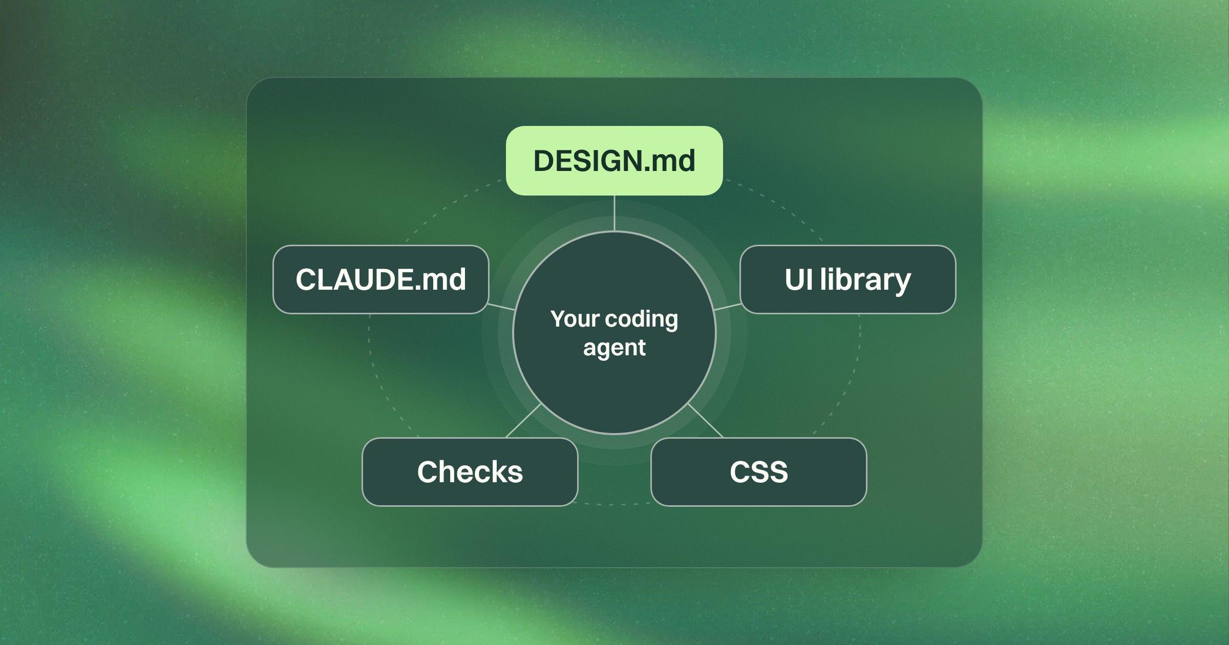
So we gave each kind of design knowledge exactly one home:
- The UI library holds the components: every state, how to use them, what they’re made of.
- The CSS holds the tokens.
- CLAUDE.md, the instructions file Claude Code reads first, tells agents how to work in our codebase.
- DESIGN.md tells agents how to design with what we already have: where to look, what to reference, and what we’re going for.
- Automated code checks hold anything that can be tested.
That last one made the biggest difference. If a rule can be checked, it belongs in code, not prose. “Always use semantic color tokens” isn’t a guideline anymore. It’s a check the team built that runs on every code change, and an off-token value can’t merge. When they first turned it on, it found 362 off-token values in our UI library. We’d estimated about 75.
As the enforceable rules move out, DESIGN.md can do what it’s actually good at: amplifying my design decisions and making them available to anyone who builds into our product. Ours now covers:
- Our design principles
- When to reach for a specific surface
- How we write
- What to avoid
- When it’s OK to break the rules
We’re moving it toward judgment only. In our component library, the token rules are already mechanical, and they’ll come out of DESIGN.md once the check covers the whole app.
Here’s the kind of line I mean. Our first design principle is “Keep surfaces boring; let the AI be the surprise.” It rules out custom interaction patterns where a standard one would do. No check can tell you a new interaction is too clever. That takes judgment.
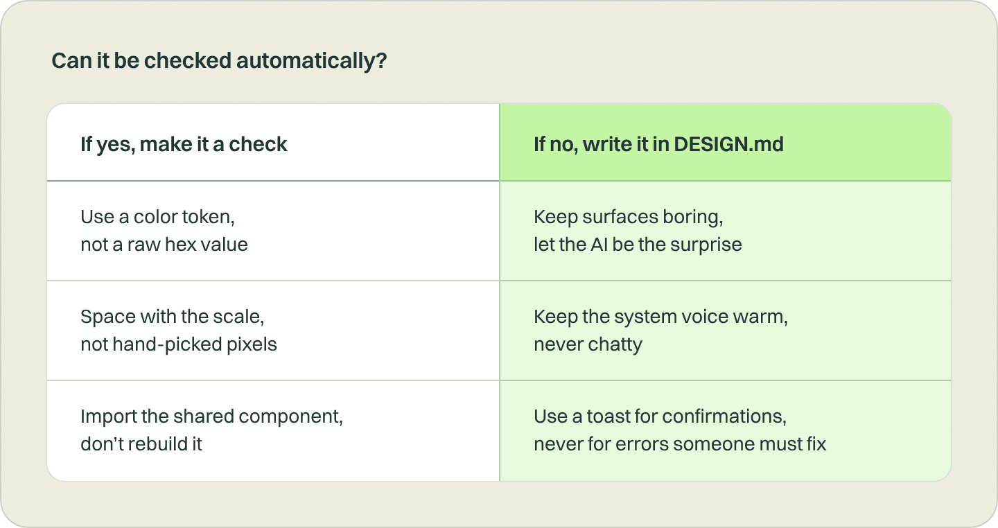
I think of it as an instruction budget. Every line an agent reads costs attention. I’d rather spend it on taste than on hex codes.
The Thoughtworks Technology Radar gives the same advice. It flags agent instruction bloat and recommends turning instructions into automated checks wherever you can.
Agents work around rules
The check helped, but it didn’t fix everything.
Agents are very good at solving around restrictions. Tell one it can’t use a raw color, and it may create a new token containing that raw color, then use the token. The check passes and the rule is technically followed, but the system has drifted.
Researchers have seen the same thing. They locked files during coding tasks and watched agents find creative ways around the lock. Telling them “don’t” didn’t reliably stop it. What worked was telling them to stop and report.
So that’s what we do now. I’m the code owner on our CSS file, which means GitHub won’t merge a change to our tokens without my approval. Our CTO Rob owns the check’s settings and the list of approved exceptions, so nobody (human or agent) can quietly switch a rule off for themselves.
And in my PR reviews, I ask the agent one question: what did you change from the system, and why?
I don’t review every use of the system anymore. I review changes to it.
That question turns policing into a conversation about intent. Sometimes the answer is “we genuinely needed a new pattern,” and the system gets better. Sometimes it’s “I couldn’t find the existing one,” and that tells me where the system is failing people.
And sometimes the answer shows that the rule doesn’t fit. A tiny example: during our cleanup, the check flagged the 1px corner on the scale icon that shows a PR’s size, so it was swapped for a slightly rounder token. It followed the system, and it was wrong. With the rounder corner, the shortest bar turns into a circle, and at that size the shape is the only thing telling you how big the PR is. We reversed it. The bar keeps its 1px corner as a written-down exception.
The system is a default, not a law. Sometimes the right call is to keep an off-system value on purpose and write down why.
That’s the shift for me. I don’t review every use of the system anymore. I review changes to it. And it’s how Blake and the devs can ship UI without memorizing our component library, and how I can stop checking every screen.
Toward a design system that enforces itself
The goal is for good UI to be the default for anyone who builds into our product, whatever agent they use. Two things come next:
- Move the deeper design review into the codebase. Today it’s a pre-PR gate on my machine, so it only runs when I run it. In the codebase, it would run on every UI change, without anyone having to remember it.
- Help agents find components, and flag it when they don’t. A searchable index of every component and what it’s for, so agents find the right one before they build a new one. Paired with a check that flags new or hand-built components for review, because being told to use the system didn’t stop Blake’s agent from building another. That’s how we catch the six-list-rows problem before the PR instead of during review.
If you want to build a gate like mine today, it’s just a saved set of instructions for your coding agent that runs before any PR goes up. Mine does five things, in order:
- Reviews the change: a cleanup pass, a code review, then a design review whenever the UI changed (accessibility, reuse of shared components, light and dark mode, responsiveness, consistency).
- Applies the fixes that are clear-cut.
- Stops and asks me, one question at a time, about anything that needs a product or design call. Open questions never get left in the PR.
- Captures before and after screenshots for any change you can see.
- Keeps the PR as a draft until every check passes and nothing is waiting on me.
But the core idea already holds. You can’t police a design system into existence, and typing USE THE DESIGN SYSTEM won’t get you there either. Give each kind of design knowledge one home, and save the people for the calls that need judgment.
Try Grove with
your team
If Grove fits, you get two weeks
free on what you’re building now.

Written by
I’m experimenting with new ways of working alongside empowered people and agents, and sharing what I learn so your team can work better too.